Kunafa Todo App
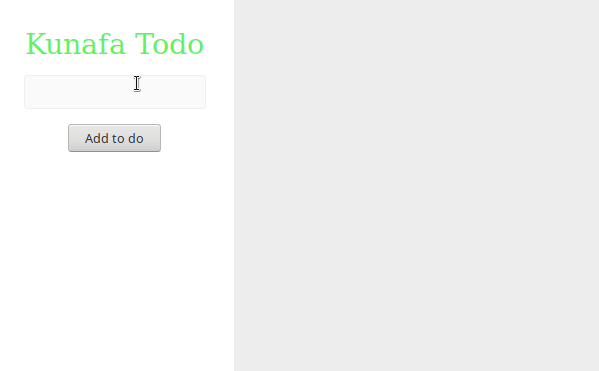
In this tutorial we will build a Todo app using Kunafa. This tutorial will cover the basic Kunafa concepts, including building views, styles, components, and components lifecycle. Also, we will be using MVVM architecture and Observables, though you don't have to. Here is what will be building.
And here is the complete code for the demo.
Basic view
To get things going, create a new Kotlin/Js project (you can follow this guide). Then inside the main() function call the page function.
fun main() {
    page {

    }
}
The page component correspond to an HTML body, and it is the root of the app. Next, we will create a horizontal layout that has two vertical layouts children.
fun main() {
    page {
        horizontalLayout {
            style {
                width = matchParent
                height = matchParent
            }

            verticalLayout {
                style {
                    width = weightOf(1)
                    minWidth = 200.px
                    height = matchParent
                    backgroundColor = Color.white
                    padding = 32.px
                    alignItems = Alignment.Center
                }

                textView {
                    text = "Kunafa Todo"
                    style {
                        fontSize = 32.px
                        color = Color(100, 240, 100)
                    }
                }

                textInput {
                    style {
                        width = matchParent
                        backgroundColor = Color("#fafafa")
                        border = "1px solid #efefef"
                        padding = 8.px
                        borderRadius = 4.px
                        marginTop = 16.px
                    }
                }
                button {
                    id = "myButton"
                    text = "Add to do"
                    style {
                        marginTop = 16.px
                    }
                }
            }

            verticalScrollLayout {
                style {
                    width = weightOf(2)
                    height = matchParent
                    backgroundColor = Color("#ededed")
                }

                verticalLayout {
                    style {
                        width = matchParent
                        height = wrapContent
                        padding = 8.px
                    }
                }
            }
        }
    }
}
Notice that the style function is used to define the views styles. The styles are mostly CSS with some helpful values to abstract the CSS border cases such as matchParent, and wrapContent. For example, the first vertical layout width is weightOf(1) and the second is weightOf(2) which means that the second is twice as big as the first one. Also, notice that the second vertical layout is a verticalScrollLayout to allow its content to be scrollable. Keep in mind that for verticalScrollLayout, its height should never be wrap content. It should be either match parent or fixed size.
Creating a component
Now the add button does nothing. We want it to create a new todo item when clicked. To do so, we will need to add a click listener and hold reference to the list verticalLayout. To keep thing tight and clean, let's create a component to hold all these references and logic.
Extracting the above view to a component is pretty easy. Just create a component and move the view to the getView function as follows:
fun main() {
    page {
        style {
            height = matchParent
            width = matchParent
            position = "fixed"
        }
        mount(TodoComponent())
    }
}

class TodoComponent : Component() {
    override fun View?.getView() = horizontalLayout {
        style {
            width = matchParent
            height = matchParent
        }

        verticalLayout {
            style {
                width = weightOf(1)
                minWidth = 200.px
                height = matchParent
                backgroundColor = Color.white
                padding = 32.px
                alignItems = Alignment.Center
            }

            textView {
                text = "Kunafa Todo"
                style {
                    fontSize = 32.px
                    color = Color(100, 240, 100)
                }
            }

            textInput {
                style {
                    width = matchParent
                    backgroundColor = Color("#fafafa")
                    border = "1px solid #efefef"
                    padding = 8.px
                    borderRadius = 4.px[]()
                    marginTop = 16.px
                }
            }
            button {
                id = "myButton"
                text = "Add to do"
                style {
                    marginTop = 16.px
                }
            }
        }

        verticalScrollLayout {
            style {
                width = weightOf(2)
                height = matchParent
                backgroundColor = Color("#ededed")
            }

            verticalLayout {
                style {
                    width = matchParent
                    height = wrapContent
                    padding = 8.px
                }
            }
        }
    }
}
Now, we need a reference to the todo items list layout, and the text input (in order to clear it after a new todo item is added). Inside the TodoComponent, define the following:
    private var listLayout: LinearLayout? = null
    private var todoTextInput: TextInput? = null
and then assigns to them their respective views.
            todoTextInput = textInput {
                style {
                    width = matchParent
                    backgroundColor = Color("#fafafa")
                    border = "1px solid #efefef"
                    padding = 8.px
                    borderRadius = 4.px
                    marginTop = 16.px
                }
            }
and
            listLayout = verticalLayout {
                style {
                    width = matchParent
                    height = wrapContent
                    padding = 8.px
                }
            }
Adding logic
To separate the logic from the view, we'll create a ViewModel to maintain the state and logic of the Todo component. But before doing so, we need to define what a Todo Item is. A todo data structure is what holds the todo item data.
data class TodoDs(val text: String, var isDone: Boolean = false) {
    val id: Int = nextId

    companion object {
        private var nextId = 0
            get() = field++
    }
}
The id is sequential and is automatically assigned (with the help of the companion object).
Now, the view model can be defined as follows:
class TodoViewModel {
    val onItemAdded = Observable<TodoDs>()

    private val todoItemsList = mutableListOf<TodoDs>()

    fun addNewTodo(todoText: String?) {
        if (todoText.isNullOrBlank()) return
        val ds = TodoDs(todoText)
        todoItemsList.add(ds)
        onItemAdded.value = ds
    }
}
The view model holds the todoItemsList and communicate the changes of the list through Observables. Notice that the view model does not hold reference to any view.
Going back to the view, the add button needs a click listener. We need to call the viewModel.addNewTodo() function. First, let's pass the TodoViewModel to the TodoComponent.
class TodoComponent(private val viewModel: TodoViewModel) : Component()
and in the main()
    page {
        mount(TodoComponent(TodoViewModel()))
    }
then inside the TodoComponent, let's create onButtonClicked() function
    private fun onButtonClicked() {
        viewModel.addNewTodo(todoTextInput?.text)
        todoTextInput?.text = ""
    }
and finally, add the click listener:
            button {
                id = "myButton"
                text = "Add to do"
                style {
                    marginTop = 16.px
                }
                onClick = {
                    onButtonClicked()
                }
            }
Now, the TodoComponent needs to be listening to the Observable in the view model. This is go to the onViewCreated lifecycle. This is called once when the view is created.
    override fun onViewCreated(lifecycleOwner: LifecycleOwner) {
        viewModel.onItemAdded.observe(::addItem)
    }

    private fun addItem(ds: TodoDs?) {
        ds ?: return
        val component = TodoItem(ds)
        listLayout?.mount(component)
        todoViews[ds.id] = component
    }
where todoViews is defined as
private val todoViews = mutableMapOf<Int, TodoItem>()
and TodoItem is
class TodoItem(
    private val todoDs: TodoDs
) : Component() {

    override fun View?.getView() = horizontalLayout {
        addRuleSet(Style.rootLayout)

        view {
            addRuleSet(Style.circleBasic)
        }
        textView {
            style {
                width = weightOf(1)
                fontSize = 16.px
            }
            text = todoDs.text
        }
    }

    companion object {
        object Style {
            val circleBasic = classRuleSet {
                width = 8.px
                height = 8.px
                borderRadius = 8.px
                border = "1px solid #888"
                marginRight = 8.px
            }
            val rootLayout = classRuleSet {
                width = matchParent
                border = "1px solid #d4d4d4"
                marginTop = 8.px
                padding = 8.px
                alignItems = Alignment.Center
                cursor = "pointer"
                backgroundColor = Color.white
                hover {
                    boxShadow = "0px 4px 3px #bbb"
                }
            }
        }
    }
}
Notice how we did not use the style function to define styles in TodoItem and however we used rulesets inside the companion object and then added it with addRuleSet(Style.circleBasic). This is because the TodoItem is created multiple times and we don't want a new style created for each item.
Removing items and toggling state
Well, we've created the basic blocks of the app. To allow items to be deleted, you can do the same as we did before. Add delete button to the TodoItem, and call the view model when it's clicked. Add a deleteItem(id: Int) function inside the view model and communicate the changes to the TodoComponent with Observable. The same goes for toggling the state.
You can find the full code here.
Final thoughts
We've created a complete Todo App in this tutorial. We hope that this will give you an understanding of how Kunafa is used to create applications.